


A facilities or construction team ordering ADA compliant signs is not buying a stack of identical plaques. The useful first decision is which openings need raised characters and Grade 2 braille, and which messages on the same floor stay visual only. Get that split onto a sign schedule before anyone picks a finish.
ADA compliant signs identify permanent rooms and spaces with raised characters and Grade 2 braille, mounted so the tactile characters sit between 48 and 60 inches above the finished floor. Directories, overhead directionals, occupant names, and short-term notices are a separate visual package. One door plaque can hold both.
The sections below walk a healthcare, education, government, or commercial project from the opening list to materials, mounting, and a single fabricator. The specification catalog lives in the U.S. Access Board sign guide. This guide is the planning work that sits in front of it.
Which Openings Belong on an ADA Compliant Signs Schedule?
Put permanent room and space identification, required exit-door labels, and required elevator labels on the tactile schedule. Leave directories, overhead directionals, and building addresses off that schedule.
Mark the floor plan before anyone designs a plaque. The question is whether the sign identifies a permanent room or space, not whether it has words on it. Under the 2010 ADA Standards, section 216.2, interior and exterior signs that identify permanent rooms and spaces are the tactile signs, where those signs are provided. The room number or permanent room name is the tactile line. An occupant name, a logo, hours, or a phone extension on the same plaque can stay visual.
Review these openings, then confirm them with the architect or code official.
- Restrooms and other permanent rooms identified at the door.
- Exit stair doors, exit passageways, and exit discharge labels under section 216.4.1.
- Elevator floor levels, car controls, and emergency communication devices.
- Suite and office entrances with a permanent room or space name.
- Mechanical, electrical, and other service rooms the drawings identify.
That list is a planning set, not a code that applies to every building the same way. The owner, architect, or authority having jurisdiction confirms which spaces and which edition of the standard are on the permit set. Note where each sign sits relative to the doorway. The doorway is how someone finds the sign by touch, and latch-side wall space is what the fabricator actually needs.
Leave the rest of the building's signs in a visual column. Directories, overhead directionals, and building addresses are not tactile door signs. An exterior sign that identifies a permanent space but is not at that space's door does not have to be tactile, though the visual character rules still apply. A monument or pylon that marks the property is the same kind of sign. Adding Grade 2 braille to a directory because the building has an ADA program is how schedules get expensive and still miss the doors that need a tactile plaque.
Carolina Signs and Wonders builds this opening list into a fabrication package through its ADA and wayfinding signs work, after the design team confirms the applicable requirements.
What Goes on One ADA Compliant Sign?
One ADA compliant sign can carry a tactile room name, visual-only hours, and an occupant name that is not required to be tactile. Specify each line by how someone uses it.
The 2010 ADA Standards for Accessible Design treat sign content by type. A single plaque is allowed to mix them. The U.S. Access Board uses a plain example: the room number is visual and tactile, the hours are visual only, and the occupant name does not have to be either.
- Tactile identification. The permanent room number or room name, in raised uppercase characters, repeated in Grade 2 braille, on a non-glare surface with clear contrast.
- Visual-only information. Hours, a phone extension, or a short instruction. Legible, but not automatically braille.
- Identity that is not tactile. An occupant name, company name, or logo may sit on the same plaque without raised characters.
Some messages stay outside the tactile rules when they are the whole sign. Temporary notices posted for seven days or less, menus, and seat or row numbers are in that group. So are signs in non-public areas of a detention or correctional facility. Building directories and company logos are exempt as well. Use the exemption to avoid replacing signs the standard does not cover, and to avoid skipping the doors it does.
Write the three lines as separate rows on the sign schedule. That is what lets a reviewer check braille against the room name only, and what lets a later tenant change an insert without touching the tactile plate. For the wider set of workplace signs around that plaque, the office sign planning guide covers types and materials for an office program.
How Do Materials Affect ADA Compliant Signs?
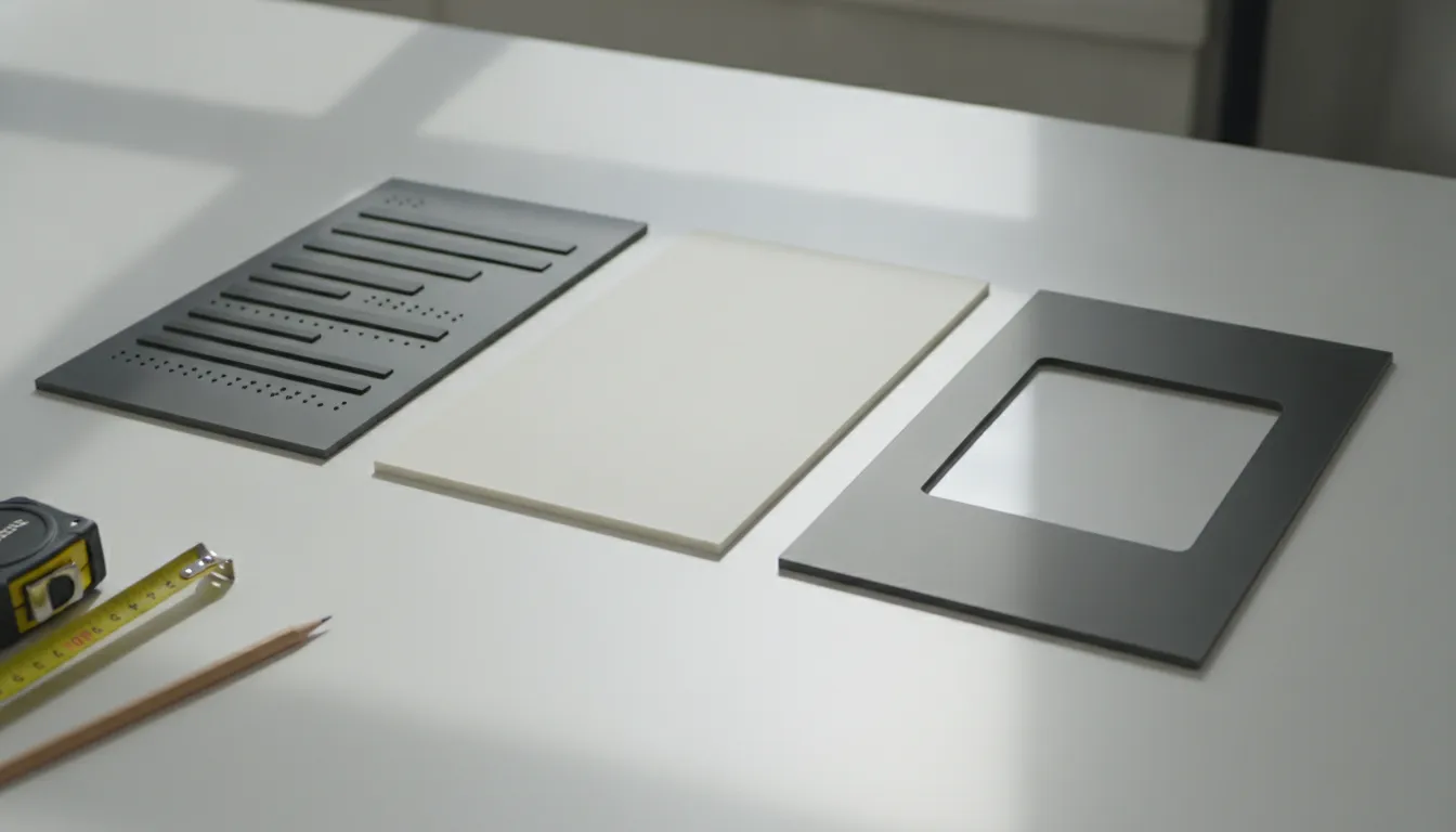
Choose a matte plaque and a raised-character method that keep contrast and a non-glare finish after cleaning. A glossy brand color can fail that finish even when the letters are raised.
Material is a maintenance decision, not a catalog preference. Raised characters have to stay raised, at least 1/32 inch off the surface, and the plaque has to stay non-glare with enough contrast to read. A finish that looks right on day one and shines under the facility's cleaner is a failed sign.
| Option. | Where it fits. | Watch-outs. |
|---|---|---|
| Photopolymer or applied raised characters on a matte plaque. | Permanent room identification that needs tactile text and Grade 2 braille. | Confirm the raise survives cleaning and that the character color stays distinct from the plaque. A high-gloss topcoat can fail the non-glare finish. |
| Painted or subsurface visual-only panels. | Directories, overhead directionals, and other signs that are not tactile door identification. | Still need readable contrast and glare control. Do not add braille only because the building has a tactile package. |
| Insert or changeable occupant windows. | Suites where the name changes and the room identification does not. | Keep the insert off the tactile plate. The window should stay legible and should not introduce a reflective surface over the raised characters. |
Match the brand through shape, layout, and a controlled color, not through a gloss level copied from a print standard. Custom sign fabrication can hold one finish family across a floor while the tactile and visual signs stay on their own rules. Review the finish against the Access Board guide before the sample is approved.
Where Should ADA Compliant Signs Be Mounted?
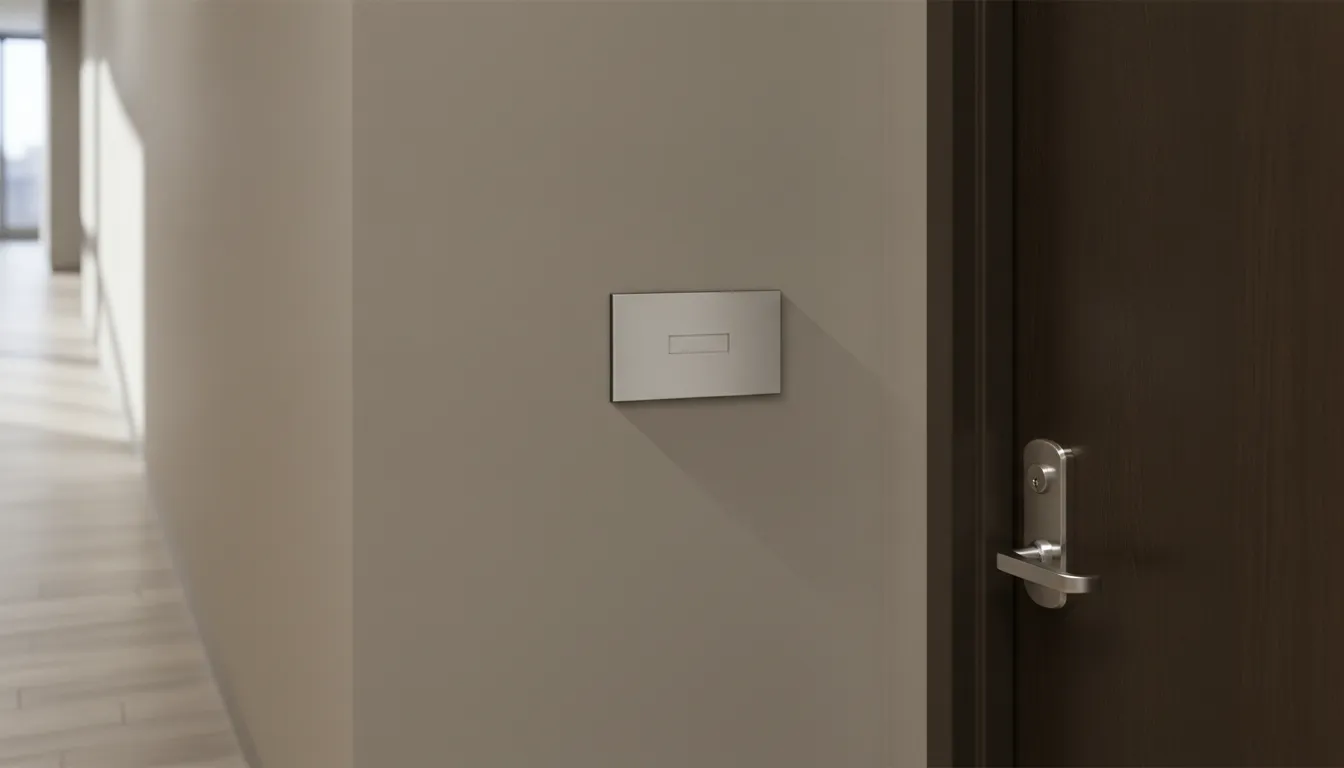
Mount tactile signs so raised characters sit 48 to 60 inches above the finished floor. Use the latch side when the wall allows. Keep an 18 by 18 inch clear floor centered on the characters, open to 80 inches.
Height and clear floor are the two checks a correct sign can still fail. Measure the 48-inch minimum from the baseline of the lowest tactile character and the 60-inch maximum from the baseline of the highest tactile character. A crew that measures to the top of the plaque, or to the subfloor before finish flooring, will miss that window.
Latch-side placement matters because the doorway is the cue for finding the sign by touch. If a closer, a card reader, or a full-height wall guard takes that wall, the sign does not slide to the hinge side on installation day. The schedule names the fallback location before the holes are drilled.
Add mounting conditions to the schedule next to each room number.
- Name the surface: drywall, tile, glass, or a wall panel.
- Record the finished floor the height is measured from.
- Mark the latch side, and a fallback if that wall is blocked.
- Note hardware, corner guards, and casework that take clear wall.
- Confirm the 18 by 18 inch clear floor, open to 80 inches.
Overhead and post-mounted signs are a different package. They are usually visual directionals. Signs above a circulation path need 80 inches of headroom. A post-mounted panel whose leading edge sits between 27 and 80 inches high cannot project more than 12 inches into the path. Commercial sign installation should happen after final door hardware and wall finishes, with a punch that checks height, latch side, clear floor, contrast, and braille on the wall, not only on the shop drawing.
How Do You Coordinate ADA Compliant Signs with the Rest of the Building?
Keep ADA compliant signs as the tactile room package. Specify directional, egress, and symbol signs separately so braille is not added to every panel in the building.
One drawing labeled "ADA signage" often mixes door plaques, overhead arrows, a lobby directory, and parking symbols. Those are different signs. Directional signs, including means-of-egress signs required by the applicable life safety code, must meet the visual character rules in section 703.5. They are not tactile plaques. Directions to accessible means of egress required by the International Building Code follow the same visual criteria.
Symbols are specific. The standards call for the International Symbol of Accessibility, a TTY symbol, or an Access for Hearing Loss symbol where those elements are provided. They do not go on every office door. A restroom, an accessible entrance, an assistive-listening counter, and a designated parking space each get the symbol that matches the element.
The systems around the door package have their own planning guides:
- Interior wayfinding for multi-floor buildings covers directories and floor logic.
- Hospital wayfinding signage covers clinical destinations and visitor routes.
- Emergency and egress signage covers exit identification that life safety codes require.
A short coordination sequence keeps the tactile package from absorbing the rest of the program:
- Start from the architect's room schedule and mark every permanent room and space.
- Split each message into a tactile column and a visual-only column before design.
- Review accessibility symbols against the code drawings, not a brand icon set.
- Install tactile signs after door hardware and wall finishes, then punch height and clear floor in the field.
That sequence lets a healthcare floor, a campus building, or a government office share one fabrication package without turning every directional panel into a braille sign.
How Do You Choose a Partner for ADA Compliant Signs?
Choose a partner who can separate tactile and visual content on one schedule, hold a non-glare finish, and mount the signs with the general contractor. The owner, architect, or code official still confirms which edition of the standard applies.
Carolina Signs and Wonders designs, fabricates, and installs commercial sign packages from Charlotte for projects across North Carolina and South Carolina, including multi-state installation programs. The useful test is not a compliance slogan. It is whether one shop can carry the schedule from the room list through fabrication and a field punch.
Questions worth asking before the package is awarded:
- Can the shop split tactile room identification from visual-only hours, directories, and directionals on one schedule?
- Will the finish stay non-glare after the cleaning method the facility uses?
- Who confirms latch-side wall space with the general contractor before the signs ship?
- Can the same team match a later phase or a second building without restarting the specification?
- Does the punch list check height, clear floor, contrast, and braille on site?
No fabricator certifies the building. Carolina Signs and Wonders designs and installs to the published standards. The owner, architect, or authority having jurisdiction confirms the edition on that permit set. Read more about the Carolina Signs and Wonders team and review installed project work before you send a room schedule.
A useful first submittal is the architectural room list, the door hardware schedule, and a note on wall finishes. From that, the shop can return a sign schedule with tactile and visual columns, mounting surfaces, and a finish sample.
Request a quote for your ADA compliant sign package
Frequently Asked Questions
What are the ADA requirements for signage?
The 2010 ADA Standards cover signs that identify permanent rooms and spaces, certain exit and elevator labels, and specific accessibility symbols. Tactile signs need raised characters, Grade 2 braille, contrast, and a non-glare finish, with tactile characters between 48 and 60 inches above the finished floor. Directories, occupant names, and short-term notices follow different rules.
How do you install ADA signs?
Install tactile signs after the finished floor, door hardware, and wall surface are in place. Set the sign on the latch side when space allows. Keep tactile baselines inside the 48 to 60 inch range. Leave an 18 by 18 inch clear floor centered on the characters, open to 80 inches. Punch height, location, contrast, and braille. Do not stop at checking that the plaque is attached.
Do ADA signs need to be all caps?
Raised tactile characters are uppercase. Visual-only copy on the same sign, such as hours or a directional note, does not follow that rule. The room name or number is the raised, all-caps line. Hours underneath can be ordinary visual type.
Did ADA sign rules change for 2026?
Projects are still designed to the 2010 ADA Standards for Accessible Design unless the authority having jurisdiction adopts a different edition on that permit. There is no separate 2026 sign code. Confirm the edition on the drawing set, then build the schedule to it.
Does every sign in the building need braille?
No. Braille and raised characters apply to tactile identification of permanent rooms and spaces, plus specific exit and elevator labels. Directories, overhead directionals, company logos, and occupant names are not turned into braille because the building has an ADA sign package.
Plan the Sign Package Before the Walls Close
Send the room schedule, door hardware notes, and wall-finish plan. Carolina Signs and Wonders will return a tactile and visual sign schedule you can price with the rest of the project.


